What is the COSMIC Mutation Graph?
This graph provides a quick visualization of a variant's prevalence across different cancer types, using data from the COSMIC Mutation Census. You can find it in the details page (or "variant drawer") for your selected variant.
The graph displays the top five tissues where the mutation is most frequently observed, allowing you to quickly assess its tissue-specific relevance.
- 💡 Note on the Data Source: The graph is based on the COSMIC Mutation Census, which includes variants with a frequency of >1% in at least one tumor type. This means that rare events might not be represented (even if annotated in COSMIC).
How to Read the Graph 📊
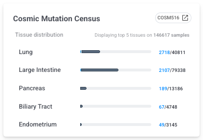
Each row on the graph represents a specific tissue and is broken down into three parts:
-
Tissue: The name of the cancer tissue type.
-
Frequency Bar:
-
The light blue portion of the bar represents the number of samples with the mutation.
-
The dark blue portion represents the number of WT samples in that tissue.
- The light grey portion, and total size of the bar, is the sum of sample counts across the 5 selected tissues.
-
-
Counts: A fraction showing the exact numbers (
mutated samples / total samples in that tissue).
The title of the graph (e.g., "Displaying top 5 tissues on XX samples") tells you the total number of samples across all five displayed tissues that were used to generate the view.
Limitations
- Availability - October 2025: This feature is currently available for short variants (SNVs/Indels) in the newest RUO workset versions. Support for CNVs and fusions will be introduced in future releases.